A landing page is defined by Unbouce as: “In digital marketing, a landing page is a standalone web page, created specifically for the purposes of a marketing or advertising campaign. It’s where a visitor “lands” when they have clicked on a Google AdWords ad or similar.” So in essence, a landing page is a blip of your website that is custom tailored to a specific promotion you are running.
Landing page copy is incredibly important. It is where your would-be customers go when they click on an ad, so they have to be intrigued enough to follow through on your landing page. There are 6 things that are absolutely critical to a successful landing page creation, and of course I’m going to explain them all to you.

Headline and Sub-Headline
These go hand in hand for every. single. piece of copy you write. A captivating headline should always attract your readers after less than 3 seconds, you don’t have long, especially on the internet so you better wow them from the get-go. I can promise you, if your headline sucks, your conversion rate will suck. A good headline addresses a problem that you want to solve. Today our example is going to be getting people to register for a webinar that will show them how to use their iPhone.
Endless Information at Your Fingertips
As you can see we created an intriguing headline with a problem we want to solve for them, there’s a whole bunch of information out there for them, and they don’t know how to get to it (we’ll tell them how to solve it in the sub-headline).
Learn the ins and outs of how to operate your iPhone
See, we are telling them what we’re doing, and how it directly correlates to the headline.
So now I’ve caught the attention of the reader, because I have already targeted them with ads on being a new iPhone user, or being a beginner in the iPhone realm, and they have landed on my landing page wanting to know more.
Body Copy

Body copy for a landing page should be short and sweet. Because this is a webinar, I plan to say a short blurb about the webinar and detail in bullets the topics I will cover.
During this live webinar on July 12th, 2019 at 2:00 p.m. ET, we will go into detail on how to use your new iPhone XS and the new features revealed with its release. In this webinar we will discuss:
- How to use portrait mode
- How to add parental controls to other devices
- Hidden features
- And much more!
As you can see, in my body copy I said what I’m doing (webinar), when I’m doing it (July 12th, 2019 at 2:00 p.m. ET), and what I’ll be covering (bullet list). The 3 basic things a reader would need to know in order to register for my webinar.
Form (Lead Capture)

The most important thing that needs to be on your landing page, is a method in which your users can buy/register/sign-up/download whatever it is you want them to do. Since we’re doing a webinar, we’ll be asking them to register for it. (Don’t say “sign-up” for a webinar, you sign-up to receive a newsletter, you sign-up to play tee-ball, you register to attend something). So in order to register for a webinar we have to get them to fill out a form. A form is huge in the landing page world. A form is a method in which you’ll capture the lead because they want to be captured, you don’t have to farm for these leads, or cold call, or any other grimey method. These people want to be contacted and they are giving you everything you need to do so. Form copy is super duper easy. Always remember: The shorter the form, the better it performs. Don’t make them fill out frivolous details, stick to the bare minimum. Our form will look something like this: (please note: this is NOT a designing a landing page demo *I’ll get to that another day* this is simply for copy, so ignore the grey color and basic fonts)
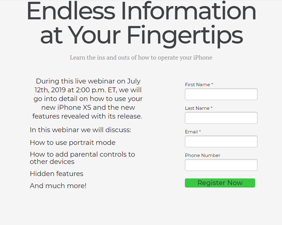
Notice how my form is short, i have 3 required fields, and 1 optional field, and my call to action button stands out and tells them exactly what I want to do.
Call To Action
CTA

The 5th most important thing in your landing page copy ties in directly with your form, a call to action. A call to action is simply telling your reader/future-customer what you want them do to. In this example, I want them to register for this webinar, and I want them to do it now. So, my call to action is simply Register Now. If you want people to sign-up for your newsletter, it could be Sign-Up Today, if you want people to download your eBook it could be Download Now. You see where I’m going with this right? A great CTA is short and bossy. Don’t be afraid to tell people what to do, if you’re timid, you won’t get results. Be bossy, be blunt, and be straightforward. Don’t put a bunch of foo-foo text in your body and CTA because you’re trying to get awesome SEO, if you’re concise and direct in your body copy the SEO will come with it.
Contact Section

The last important thing to include in your landing page copy is a contact section. Give people a way to contact you if they have questions. A contact section doesn’t need to include a map with your exact whereabouts, but a simple Contact Us section with an email address (and maybe even a phone number) is the bare minimum you should include. Don’t just put a phone number, people nowadays don’t want to talk on the phone, they’d rather text. So unless you have a text bot, an email address will suffice.
Find this guide helpful? Share us on Facebook & LinkedIn. Have a comment you’d like to add? Go to the Contact Page above and let me know!


